It's been awhile since I've done a house tour, so I've got two rooms for you this time. After the burglary, I wasn't sure I was going to do these posts anymore but that would be letting the terrorists win, so I figured I would keep on truckin'. Besides, we have an alarm system now, so if any of you would-be burglars are reading this and decide to pay us a visit, be sure to smile real perty for the cameras.
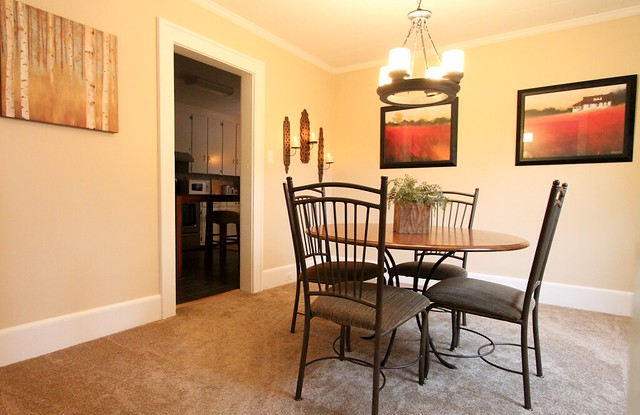
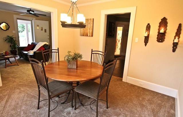
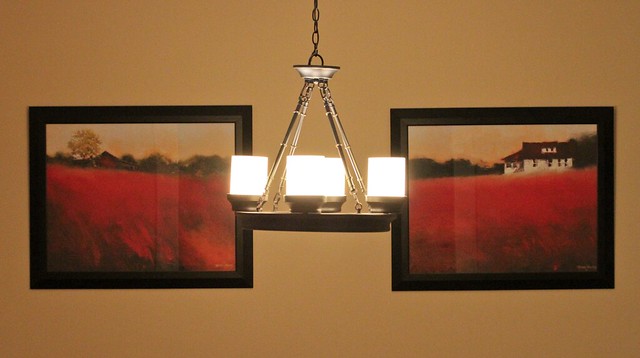
Let's start with the dining room. I thought about posting before pictures, but it was basically the same room just empty and with a shiny brass chandelier, so I didn't feel the change was drastic enough to warrant it. There's not much to this room, but we added a few things to make it our own. First, we got rid of the lovely chandelier and brought in the one we had bought for our apartment. Yes, we bought a lighting fixture for our apartment. In fact, we bought several, but we saved the original ones, so we switched them back out when we moved. This was a good way to make our apartment look better and at the same time, accumulate lighting fixtures for our new home. It's hung a little too high for my taste, but the chain has been cut, so there's no turning back now. Jerry thought he would be sweet and surprise me with having it hung when I got home one day, but it sort of backfired on him when I admitted to him that it was hung too high. I mean, I appreciated the gesture and all, but I just wish he had waited for my supervision. Apparently, it was a real pain in the ass to hang, as has been everything in this house, so I stated my opinion once and dropped the sore subject. Ah, the joys of remodeling a house...Love you, babe! ;-)
Here's the view from the kitchen. I hope to get a real grown-up table and chairs one day, but for now, these will have to do. Also, I HATE carpet in a dining room, so this will be the first room to receive hardwood flooring.
As you can see, the dining room is centrally located between the living room and kitchen.
I spotted these prints in a local framing store and fell in love. The colors are perfect, and I love that the barn in the print on the left looks a lot like one that is behind our house.
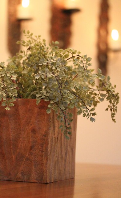
Yes, I love my fake plants. I know they are tacky, but this one is from Pottery Barn and is in a cool planter.
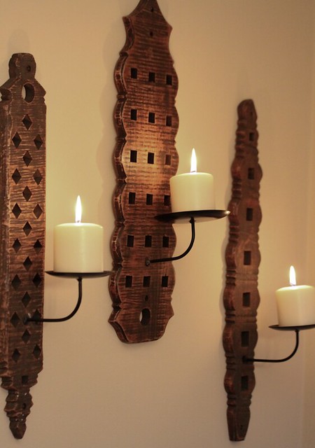
When I saw these rug beaters that had been converted into candle holders in the Pottery Barn catalog, I knew that I must hold them and squeeze them and make them mine. However, they sold out before I could save enough money to purchase them. I scoured Ebay and found a set for a reasonable price. Good ole' Ebay comes through again.
Yet another print from the famous art house, la maison de Walmart.
These dotty clutters of wood are place mats from Crate and Barrel. I thought they looked neat on the wall.
This leafy set of branches made out of metal is just a temporary place holder for the rabbit head Jerry is suppose to draw for me. Ahem...sorry, just needed to clear my throat. I'm going to put it in a cool frame, and hopefully, it will turn out similar to this at a fraction of the cost.
Buh-bye, Dining Room...
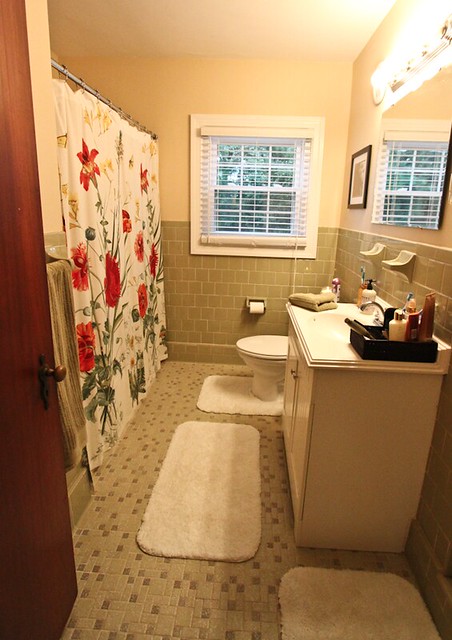
Hello, Downstairs Bath. Once again, we didn't do anything to this room except add the furnishings. I love that it has the original tile and that the tile is a pretty shade of green rather than the hideous pink's and blue's that you usually see in bathrooms from that time period.
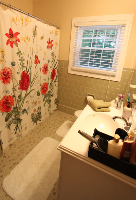
The shower curtain is from Pottery Barn, and I think that it adds a lot to the room and fits perfectly with the vintage vibe of this bathroom.
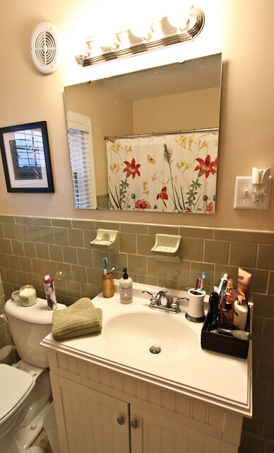
Check the wall outlets, yo! I about died when we moved in, and I discovered the bathroom didn't have electrical outlets. Oh, the horror! Thank God it was the one thing the electrician said he could do when he came out and inspected our fort of concrete walls. Of course, it took him twice as long as normal and there were big chucks of concrete and white dust all over the room when he was done. I tell ya, nothing is simple in this house.
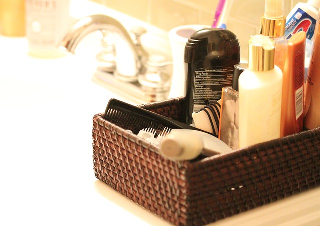
The vanity lacks drawers, so I use this basket as my makeshift drawer.
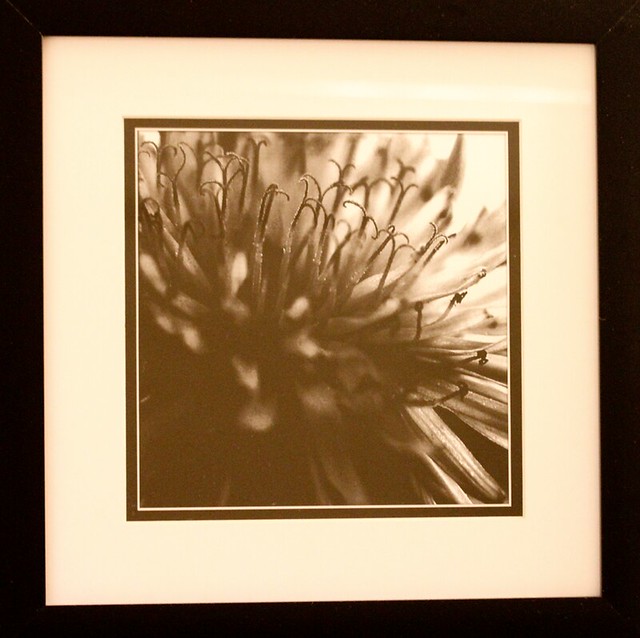
I chose a simple, black and white floral print for this room. Once again, it's from Walmart.
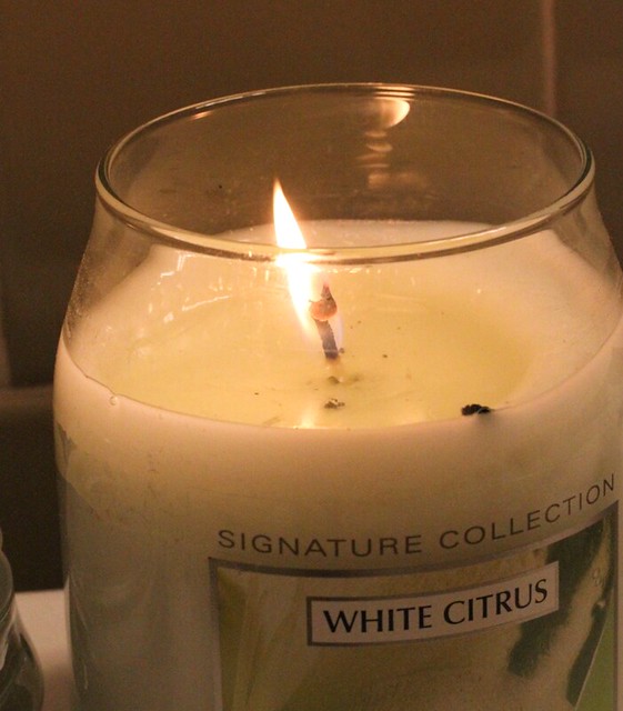
Love my candles, especially in the bathroom.
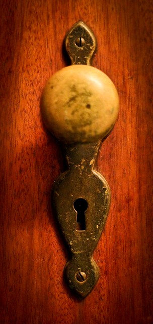
The old, original door knobs are one of the unique things that sold me on this house.
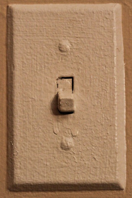
That along with the ancient, 50-layers-of-paint light switches.
Well, that's all folks! Stayed tuned for the Master Bedroom in the next installment.










Bonnie,
ReplyDeleteI like your sconces from the maison de walmart. Nice find.
I love your diningroom wall color! What is it? I want to copy you, lol!
ReplyDeleteLooks wonderful! I love the placemats as wall art. Really beautiful job!
ReplyDeleteIt has so much charm, Bonnie! I love the tile in the bathroom too! It looks like it is in excellent condition too. The dining room light fixture is gorgeous! I'm feeling inspired now to replace our old brass ones in our house.
ReplyDeleteThanks, Katie! The former owners painted the whole house that color. It's a great neutral. I found a paint can in the garage that looks like the one. I'm not sure what store they got the paint from, but the color sticker says "Almond Brittle." Good luck!
ReplyDeleteThanks, but the sconces came from Pottery Barn via Ebay. The painting of the trees and the black and white picture of the flower came from Walmart.
ReplyDeleteThanks, Kristin!
ReplyDeleteThank you! The tile looks brand new. Not a thing wrong with it.
ReplyDeleteYou'll be amazed at the difference replacing a light fixture makes.
Thanks for sharing! I love the prints. Walmart, who knew?
ReplyDelete