It's been a real downer around the old blog lately, so I thought it would do us all some good to talk about something other than new clothing purchases and the facts of life. How about I show you a room from my new house? Surely no one can find fault in that? Yeah, who am I kidding? It's sad, but I feel I should preface this post with a disclaimer: I do not consider myself an interior designer. I do not think I'm the next Martha Stewart. I just know what I like and decorate my house accordingly. People have expressed an interest in seeing pictures of the house, so I'm going to give the people what they want. That is all.
I thought the best way to do this would be to focus on one room at a time. Some rooms are still a work in progress, so this will give me some time to get those up to snuff before I do a post on them. I plan on doing one post a week on the house until you've seen the whole shebang. This way the blog doesn't become all about my house, but you still get to check it out from time to time.
It would probably make sense to start a house tour with the outside, but I don't feel the outside is up to par just yet, so I'm going to focus this leg of the tour on the kitchen. It's the only room in the house that's completely done at this point.
Here's a before photo of the kitchen:

And here's the after shot:
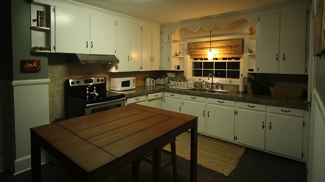
As most of you already know, the first thing we did was get rid of the old, red brick linoleum flooring. The former owners had kindly updated the counter top and back splash. In addition, they painted the walls and cabinets. Oddly, they left the orginal flooring. I guess I understand why - the flooring was in immaculate condition. However, I'm not a big fan of faux brick, and it didn't really seem to go with the rest of the updated kitchen. Jerry was cool with moving in with the floor as it was and updating it later. I, on the other hand, was determined to tile over that sucker before we moved in. Of course, I won, so after a couple of You Tube videos, a trip to Lowes, and a weekend of working on our hands and knees, we had ourselves a new tile floor.
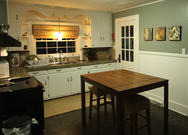
The next thing we did was paint the walls. We left the bottom half of the walls white, just as the former owners did, but painted the top half a slate green to complement the new floor. Then, it was off to buy appliances. We ended up going with stainless. At this point, I noticed that we were going with a lot of cool colors, finishes, and textures, so I decided to warm things up a bit with a natural fiber rug, a bamboo shade, and a honey stained counter height table. The table is the best thing we have bought for the house so far. The refridgerator is way on the other side of the room, so the table has been great for bridging the gap between the stove and fridge.
Fridge Area Before:

Fridge Area After: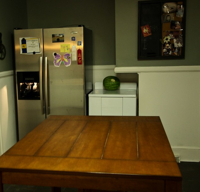
Now, that you've got an overall idea of the room, I'd like to point out a few items that really make this kitchen home for us.
First up, are the beautiful seagrass barstools I picked up from Pottery Barn. I love natural fibers because they bring a little bit of the outside into the home. Nature has always been my biggest inspiration when decorating. When I first pulled them out of the box, my mom said, "Those don't look very comfortable." Well, looks can be deceiving. They are actually very comfortable, especially for stools. They made a loud crackly sound when I first sat on them which scared me, but they haven't made a sound since. I highly recommend these bar stools and plan on picking up 2 more in the future.

Next up, are my beloved chickens. I picked these up at the Carolina Pottery on clearance for $1 a piece. Jerry and I love to walk around that place and find diamonds in the rough. Some of the art work there is really cheesy. However, there was something really endearing about these chickens. You know, there is good cheese and bad cheese. These chickens were the good kind, and I knew I wanted to incorporate them into my new kitchen.

I had these el cheapo prints from Target hanging in the bathroom of our apartment. I think they fit pretty good on this long blank wall in the kitchen. The colors go nicely too. Yay for el cheapo!

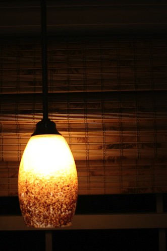
Don't tell us what we can't do! You know that electician I told you about? The one who came by and said he couldn't run a light over the sink. Well, we didn't need him. Jerry was able to run a light over the sink and install a range hood. Booya! My boyfriend's got skills, yo!
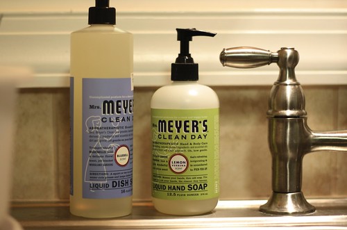
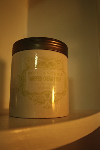
My favorite cleaning products. They smell oh, so good!
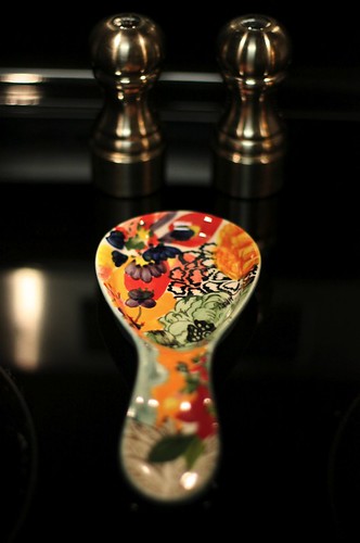
A spoon rest from my favorite store. They sell more than just clothes, don't ya know?
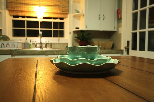
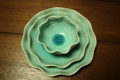
They sell plates and glasses too!
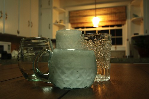
Lastly, I finished things off with some candles. I love the shelves on either side of the sink for placing those. And yes, the little birdie and the owl are indeed candles. I don't think I shall ever burn them.

So, there you have it. I know it's not earth shattering, and you're not likely to see us on Design Star anytime soon. However, it's our very own kitchen, and it's pretty special to us. We never thought a year after starting over again we would have something so nice to call our own. It's our little space to cook, make memories, and entertain family and friends. They say the kitchen is the heart of the home, and we couldn't agree more.
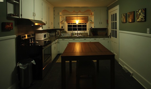
Floors: Lowes Midnight Copper Slate
Paint: Lowes Valspar Secret Moss 5005-2A
Table: Target Andres Distressed Counter Height Pub Table - Honey
Stools: Pottery Barn Seagrass Backless Barstools - Medium
Spoon Rest: Anthropologie Paisleys Spoon Rest
Dinnerware: Anthropologie Lotus Dinnerware
Glasseware: Anthropologie Soda-Lime Tumbler, Anthropologie Fleur-De-Lys Tumbler, Anthropologie Churned Stemless Wine Glass
Bird and Owl Candle: Target


Ooooh, LOVE, LOVE, LOVE your kitchen!!! It is so homey and has this calmness to it.
ReplyDeleteVery nice job! =+)
The kitchen looks fantastic! It's so honey and inviting. I'm in house buying mode and have interiors on the brain, so I can't wait for you to share the rest with us.
ReplyDeleteEveryone could use a little cock in the kitchen ;) lol
ReplyDeleteIt is beautiful, Bonnie!!! You guys did a phenomenal job!
ReplyDeleteI have to say I giggled when I saw the chicken pictures! Maybe you should talk Scott out of the ones in the Mez breakroom if you ever need a change!
ReplyDeleteOh my gosh, I love your kitchen. You did a great job!!
ReplyDeleteWhat is that thing by the fridge?
ReplyDeleteHot water heater
DeleteLove it. So warm & comfy.
ReplyDeleteVery nice! It seems quite cozy.
ReplyDeleteThis looks fantastic! I love the "after" and all
ReplyDeleteYour special touches. Nice job!
beautiful!
ReplyDeletevery pretty! What a charming cottage Kitchen! I looks really big... is it?
ReplyDeleteSo pretty and cozy! I am so happy for you!
ReplyDeleteThanks! Yes, it is big, especially considering how small our house looks from the outside.
ReplyDeleteThanks, Anita!
ReplyDeleteI find it very cozy. The table and the light over th sink made a big difference in the coziness factor.
ReplyDeleteLOL! Oh no, Alicia, the ones in the mez are creepy!
ReplyDeleteThanks, Catherine!
ReplyDeleteOh, Melissa, you dirty girl! ;-)
ReplyDeleteThanks, Kristin!
ReplyDeleteThanks! Good luck in your house hunt!
ReplyDeleteWhat a great makeover! Looks fantastic - and I LOVE LOVE LOVE that table! It seems darker in the pics than it does on the website, would you say that's just the lighting? How does the Target pic compare to real life?
ReplyDeleteLove your Kitchen. It is so you and so country cottage. I can imagine that you will enjoy this space a lot. I think you did a great job updating the kitchen, the colors and new tiles make this space feel much more coordinated. I absolute love the chicken artwork. As a little kid I used to live on a farm and had my own chickens. I still have a soft spot for chickens.
ReplyDeleteI love it! Thanks for sharing! We are in the process of redoing our old farmhouse kitchen, and I am going to steal your table idea - the stools underneath, why didn't I think of THAT??? What a huge difference all those little touches made - love the chickens and the measuring wheel. Great job!
ReplyDeleteThank you for sharing what you did with your kitchen. I've always rented, and I've never felt I can do ANYTHING with where I live, but I like to dream and feel inspired for the someday of ownership. What you have done is just lovely.
ReplyDeleteoff topic, but fyi, your picture is used on ebay here:
ReplyDeletehttp://www.ebay.com/itm/ANTHROPOLOGIE-DYNAMIC-ZIGS-DRESS-BY-TRACY-REESE-P-XS-/150845130224?pt=US_CSA_WC_Dresses&hash=item231f1205f0
Bonnie- it looks just beautiful and comfy - and wonderful! You should be very proud of yourselves for taking the time to make each room in your new home special and your own. Enjoy it and live happily there!
ReplyDeletelove it!
ReplyDeleteJust the lighting. The color on the website is spot on.
ReplyDelete